How to Read Crypto Charts: A Beginner’s Guide to Digital Asset Analysis
TL;DR: Learning how to read crypto charts comes down to four building blocks: price, time, candlesticks, and volume. This guide breaks down candlestick basics, support and resistance, trend direction, and two beginner-friendly indicators (moving averages and RSI) in plain English, then walks through a real example step by step. By the end, you’ll be able to open any crypto chart and actually understand what it’s telling you, instead of guessing.
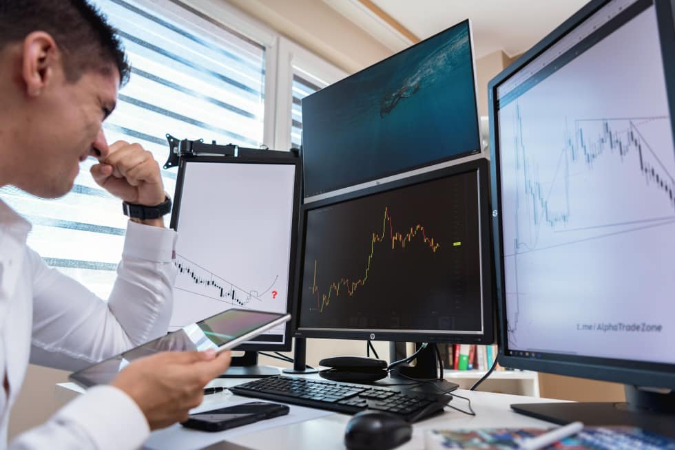
Open a Bitcoin chart for the first time and it looks like a stranger’s EKG. Red and green blocks. Squiggly lines crossing each other. Bars at the bottom that seem to mean nothing. If you’ve ever closed the app out of confusion, you’re not alone.
Learning how to read crypto charts feels intimidating, but it’s really just a visual language. Once you learn a handful of terms, the noise turns into information you can actually use.
This isn’t a trading course, and it won’t turn you into a professional analyst overnight. What it will do is give you the same foundation every serious investor starts with: the ability to look at a chart and understand what happened, what’s happening now, and what to watch for next.
We’ll go section by section, starting with the absolute basics and building up to the tools beginners actually use day to day. We’ll also walk through a real example near the end, so you can see everything applied at once instead of learning each piece in isolation. Stick with it. By the end, that “stranger’s EKG” will look a lot more like a story you can follow.
What is a Crypto Chart and What Does It Actually Show You?
A crypto chart is a visual record of an asset’s price over time. The horizontal axis (left to right) shows time, and the vertical axis (bottom to top) shows price. Together, they let you see how a coin’s value has moved, whether it’s rising, falling, or moving sideways.
That’s it. Underneath the colors and indicators, every crypto chart answers one question: what has the price done, and when?
Most platforms, whether it’s Coinbase, Binance, or TradingView, let you adjust the time frame. You can zoom into a single minute or zoom out to see five years of price history. Beginners often make the mistake of watching a one-minute chart and reacting to every tiny wiggle, when the bigger picture on a weekly chart tells a completely different story.
Charts also come in different styles. Line charts connect closing prices with a single simple line, which is easy to read but doesn’t show much detail. Bar charts show open, high, low, and close using small tick marks. Candlestick charts, which we’ll cover next, show the same information but in a format that’s much easier to scan visually. Almost every serious crypto trader defaults to candlesticks for this reason, and it’s worth learning that format first since you’ll see it everywhere.
Before you dive into indicators or patterns, get comfortable with this simple idea: a chart is just a timeline of price. Everything else, candlesticks, volume, moving averages, is built on top of that timeline to help you interpret it faster.
If you’re brand new to crypto altogether, it helps to pair this with a broader primer on crypto investing for beginners before you start analyzing charts, since understanding what you’re buying matters just as much as knowing how to read the price action.
How Do You Read Candlestick Charts in Crypto?
A candlestick shows four prices for a set time period: the open, close, high, and low. The “body” shows the range between opening and closing price, while the thin lines above and below (called wicks or shadows) show the highest and lowest prices reached during that period.
Green (or sometimes blue) candles usually mean the price closed higher than it opened. Red candles mean it closed lower. This color coding is exactly why candlestick charts became the default view on almost every crypto exchange, according to Binance Academy’s guide on reading candlestick charts.
Here’s the part that trips up most beginners: each candle represents a chunk of time you choose. If you’re looking at a “1-day” chart, each candle shows a full day of trading. Switch to “1-hour,” and each candle only covers one hour. Same coin, completely different picture, depending on the timeframe you select.
The anatomy of a single candle
- Body: the thick part, showing the range between open and close
- Wick (or shadow): the thin lines showing the highest and lowest price hit during that period
- Color: green/white usually means price went up during that period, red/black usually means it went down
A long body with short wicks tells you buyers or sellers were firmly in control the whole time. A short body with long wicks tells you the price swung a lot in both directions before settling near where it started, which often signals indecision.
Common candlestick patterns worth knowing
You don’t need to memorize dozens of patterns to get started. A few show up often enough to be worth learning first.
| Pattern | What It Looks Like | What It Often Suggests |
| Doji | Tiny body, long wicks on both sides | Indecision between buyers and sellers |
| Hammer | Small body, long lower wick | Possible reversal after a downtrend |
| Engulfing | A large candle that fully “swallows” the previous one | Strong shift in momentum |
| Shooting Star | Small body, long upper wick | Possible reversal after an uptrend |
| Morning Star | Three candles: a long red, a small one, then a long green | Possible bullish reversal forming over time |
According to Investopedia’s breakdown of candlestick charting, these patterns work best as clues, not guarantees. A hammer pattern doesn’t promise a price reversal. It just tells you buyers stepped in and pushed the price back up before the period closed. Treat patterns as one piece of evidence, not a crystal ball.
It also helps to look at where a pattern shows up, not just what it looks like. A hammer candle that appears near a known support level carries a lot more weight than the same exact candle appearing in the middle of nowhere on the chart. Context matters as much as the shape itself.
What Does Trading Volume Tell You on a Crypto Chart?
Trading volume is the total number of coins or tokens traded during a specific time period, and it usually appears as vertical bars underneath the price chart. It tells you something price alone never can: how much conviction is actually behind a move.
A price move on low volume is like a rumor with no witnesses. A price move on high volume is a fact confirmed by a crowd. If Bitcoin jumps 5% but almost nobody is trading, that move can reverse just as fast as it appeared. If it jumps 5% with volume far above its recent average, more traders agree the move is real, according to Investopedia’s explanation of trading volume.
Here’s a simple way to use volume as a beginner:
- Look at the average volume bar height over the last few weeks to get a sense of what “normal” looks like for that coin.
- When you spot a big price move, check if the volume bar is noticeably taller than usual for that same period.
- If yes, the move likely has real buying or selling behind it. If not, be more skeptical about whether it will hold.
Volume also helps confirm breakouts. If price finally breaks above a resistance level it’s been stuck under for weeks, but volume is weak, that breakout is more likely to fail and drop back down. If volume spikes noticeably during the breakout, it’s a stronger signal that buyers have genuinely taken control.
I’ve watched plenty of new investors get excited over a single green candle, only to realize a few hours later the volume behind it was nearly nothing. The price move looked exciting, but there was barely anyone actually behind it. Checking volume before reacting to a price spike is one of the simplest habits that separates a beginner from someone who’s starting to read charts like a professional trader.
What Are Support and Resistance Levels in Crypto Charts?
Support is a price level where an asset has historically stopped falling because buyers step in, and resistance is a level where it has historically stopped rising because sellers step in. Together, they act like a floor and a ceiling that price tends to bounce between until something breaks the pattern.
Think of it like a ball bouncing in a room. The floor is supported, the ceiling is resistant. The ball can bounce between them for a while, but eventually it might crash through the floor or punch through the ceiling, and that’s usually when a bigger move follows.
You can spot these levels by looking for price points where a chart has reversed direction more than once. If Bitcoin has dropped to $58,000 three separate times over the past two months and bounced back up each time, that’s a support zone worth noting. If it’s struggled to break above $65,000 repeatedly, that’s resistance worth marking on your chart.
Binance Academy’s guide on support and resistance points out that these levels aren’t exact lines, they’re zones. Prices often wiggle slightly above or below the “line” before reversing, so it’s smarter to think in ranges than in exact numbers.
A few practical tips for spotting support and resistance:
- Look for at least two or three touches at a similar price before calling it a real level, since a single bounce could just be noise.
- Old resistance often becomes new support once price breaks above it, and old support often becomes new resistance once price breaks below it.
- Round numbers ($50,000, $100,000) often act as psychological support or resistance simply because more traders place buy and sell orders around them.
- The more times a level has been tested, the more traders are watching it, which can actually make the reaction there stronger when price approaches again.
Marking a handful of these zones on your chart before you make any trading decision gives you a much clearer map of where price is likely to react, instead of feeling like every move is random.
How Do You Identify a Trend on a Crypto Chart?
A trend is the general direction price is moving over time. An uptrend shows a pattern of higher highs and higher lows, a downtrend shows lower highs and lower lows, and a sideways trend shows price bouncing within a range without a clear direction.
Spotting a trend is often the single most useful skill in reading crypto charts, because it tells you the broader context before you zoom into any single candle or indicator. Trying to make sense of one candlestick without knowing the overall trend is like reading one sentence from the middle of a book and trying to guess the whole plot.
Here’s a simple way to check for trend direction:
look at the last several major price swings. Are the peaks getting higher each time, and are the dips also higher than the previous dip? That’s an uptrend. If both peaks and dips are getting lower, that’s a downtrend. If price keeps bouncing between roughly the same high and low without progress in either direction, you’re likely in a sideways market, sometimes called consolidation.
Trend lines make this even easier to see visually. Draw a line connecting the lows in an uptrend, or the highs in a downtrend, and you get a rough guide for where price has been respecting a boundary. When price breaks clearly through that trend line with strong volume behind it, it can signal the trend is weakening or reversing entirely.
It’s worth remembering that trends exist on every timeframe at once. A coin can be in a short-term downtrend on the hourly chart while still sitting inside a much larger uptrend on the weekly chart. This is exactly why zooming out before making decisions matters so much. New investors often panic over a short-term dip that looks scary on a one-hour chart, without realizing it’s a tiny blip inside a much healthier long-term trend.
Moving averages, which we’ll cover next, are one of the most common tools traders use to confirm a trend rather than relying on eyeballing it alone.
Beginner-Friendly Indicators: Moving Averages and RSI Explained
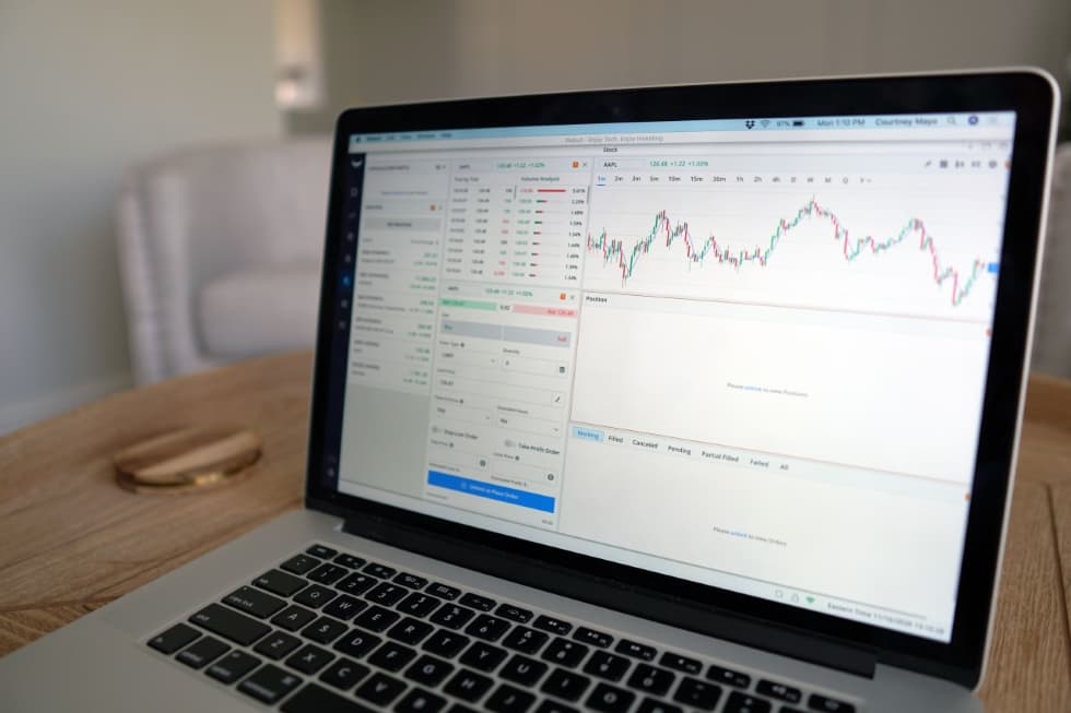
You don’t need a dozen indicators cluttering your screen to make sense of a crypto chart. Two of the simplest and most widely used are moving averages and the Relative Strength Index (RSI), and both are built into free tools like TradingView with a single click.
Moving averages smooth out price data by averaging it over a set number of periods, making the overall trend easier to see through the day-to-day noise. A 50-day moving average, for example, averages the closing price over the last 50 days and updates daily as new data comes in. According to Investopedia’s overview of moving averages, when price stays above its moving average, that’s typically read as a sign of an uptrend, and when it stays below, that’s often read as a downtrend.
A common beginner trick is watching what happens when a shorter moving average (like a 50-day) crosses above or below a longer one (like a 200-day). Traders call the bullish version of this a “golden cross” and the bearish version a “death cross.” Neither guarantees anything on its own, but both are widely watched signals, and recognizing them helps you understand why crypto news headlines sometimes get excited over a single crossover.
RSI (Relative Strength Index) measures how fast and how much price has moved recently, on a scale from 0 to 100. Readings above 70 are generally considered “overbought,” meaning the price may have climbed too fast and could be due for a pullback. Readings below 30 are considered “oversold,” suggesting the price may have fallen too far too fast. Investopedia’s RSI explainer is a solid reference if you want the full math behind it, but for a beginner, the overbought/oversold framing is really all you need to start using it.
A practical way to combine both:
check the trend using a moving average first, then use RSI to gauge whether the current move looks stretched. If price is in a clear uptrend and RSI creeps above 70, that doesn’t necessarily mean sell immediately, but it does mean you should expect some cooling off or a pullback before the next leg higher.
Neither of these indicators works perfectly on its own, and that’s normal. Combine them with support and resistance and trend direction, and you start building a fuller picture instead of relying on a single signal. This is also an area where technology is changing fast. AI-driven tools now scan thousands of crypto charts simultaneously, flagging patterns and indicator setups faster than any human could by hand, something we’ve covered in more depth in our piece on AI tools transforming how investors analyze markets. Even so, understanding the basics yourself is what lets you judge whether an AI-generated signal actually makes sense, instead of blindly trusting a black box.
Putting It All Together: How to Read a Real Crypto Chart Step by Step
All the pieces above are much easier to understand once you see them applied together on an actual chart. Here’s the exact process I’d walk through if I opened a fresh Bitcoin chart today and wanted to understand what’s happening before making any decision.
Step 1: Zoom out first.
Start on a weekly or daily chart, not a one-hour or five-minute view. This gives you the real trend without the noise of short-term price swings that mean almost nothing in the bigger picture.
Step 2: Identify the trend.
Look at the recent swing highs and lows. Are they climbing, falling, or roughly flat? This single observation shapes how you should read everything else on the chart.
Step 3: Mark support and resistance.
Scan the chart for price levels where the price has reversed direction two or three times. Draw rough lines or zones at those points so you have a visual map of where price might react.
Step 4: Check the moving averages.
Is the price sitting above or below its 50-day and 200-day moving averages? Is there a recent crossover between the two? This confirms or challenges the trend you identified in step two.
Step 5: Look at recent candlesticks near key levels.
If price is approaching a support zone, is there a hammer or bullish engulfing pattern forming? If it’s near resistance, is there a shooting star or bearish reversal candle showing up?
Step 6: Confirm with volume.
Whatever move you’re seeing, check whether volume backs it up. A breakout or reversal on strong volume carries far more weight than the same pattern on weak, quiet volume.
Step 7: Check RSI for context.
Is the asset overbought above 70 or oversold below 30? This tells you whether the recent move might be stretched and due for a pause, which helps set realistic expectations rather than chasing a move that’s already extended.
Running through these seven steps takes only a few minutes once you’ve practiced it a handful of times. The goal isn’t to predict the future with certainty, since nobody can do that consistently, even professionals. The goal is to make a more informed decision than you would have made by glancing at a single red or green candle and reacting emotionally.
I’d encourage you to practice this exact process on a demo account or with a small amount of money you’re comfortable experimenting with, rather than trying to memorize it in theory alone. Chart reading is a skill that improves through repetition, not through reading a single guide once.
Common Mistakes Beginners Make When Reading Crypto Charts
New chart readers tend to repeat the same handful of mistakes, and almost all of them come from reacting too fast to too little information.
Mistake 1: Watching the wrong time frame.
Staring at a one-minute chart and reacting to every candle is a fast way to feel anxious and make poor decisions. Zoom out to daily or weekly charts to see the bigger trend before you make any move, and only drop down to shorter time frames once you understand the broader picture.
Mistake 2: Ignoring volume.
A dramatic price swing on thin volume often reverses just as quickly as it appeared. Always check whether the volume behind a move actually supports it before treating the move as significant.
Mistake 3: Treating patterns as guarantees.
Candlestick patterns and indicator signals are clues, not certainties. The SEC’s investor bulletin on crypto assets is a good reminder that crypto markets carry real volatility and risk, and no chart pattern removes that risk entirely, no matter how textbook it looks.
Mistake 4: Skipping risk management.
Reading a chart well doesn’t matter much if you’re risking money you can’t afford to lose. Pairing chart literacy with a real plan to manage investment risk is what actually protects your capital over time, especially in a market as volatile as crypto.
Mistake 5: Trying to time every move perfectly.
Even experienced analysts get plenty of calls wrong. Academic research on technical trading rules, going back to studies like Brock, Lakonishok, and LeBaron’s classic paper on technical analysis, has long found mixed results on how reliably chart patterns predict future price movement. Reading charts is a skill that improves your odds and understanding, not a formula that guarantees profit.
Mistake 6: Overloading the chart with indicators.
It’s tempting to add every indicator available once you learn a few. In practice, five or six indicators fighting for attention on one screen usually creates confusion rather than clarity. Stick to two or three tools you actually understand well, and add more only once you’ve mastered those.
Mistake 7: Ignoring the bigger market context.
A single coin’s chart doesn’t exist in a vacuum. If Bitcoin is falling sharply, most smaller coins tend to fall with it regardless of their individual chart patterns, a relationship often called correlation. Always glance at the broader crypto market before assuming a pattern on one specific coin will play out as expected.
The fix for all of these is the same: slow down, zoom out, and treat chart reading as one tool in a bigger financial strategy rather than the whole strategy itself.
Conclusion
Reading crypto charts isn’t about memorizing every indicator or predicting the market perfectly. It’s about understanding four fundamentals: price and time, candlesticks, volume, and trend direction. Layer in support and resistance, then add moving averages and RSI once you’re comfortable, and you’ll already be ahead of most beginners staring at charts with no idea what they’re looking at.
Give yourself permission to start simple. Pull up a chart today, identify whether it’s in an uptrend or downtrend, find one support level, and check whether recent volume backs up the latest price move. Run through the seven-step process we covered above a few times, and it will start to feel automatic rather than overwhelming.
If you’re serious about building long-term wealth in crypto and beyond, chart reading is just one piece of the puzzle. Pair it with a solid long-term wealth building strategy so your chart skills serve a bigger financial plan, not just short-term guesses. Keep practicing, keep learning, and the charts that once looked like noise will start to read like a story you can follow.
Frequently Asked Questions
1. What’s the best free tool for beginners to read crypto charts?
TradingView and CoinGecko both offer free, beginner-friendly charting tools with built-in indicators like moving averages and RSI. Most major exchanges, including Binance and Coinbase, also have built-in charts you can use without any extra software, which makes them a good starting point if you already have an account.
2. How long does it take to learn how to read crypto charts?
You can learn the basics, candlesticks, volume, and trend direction, in a few hours of focused practice. Getting comfortable enough to spot patterns quickly and combine multiple signals usually takes a few weeks of regularly checking real charts and practicing the step-by-step process.
3. Is technical analysis as reliable for crypto as it is for stocks?
Crypto markets tend to be more volatile and trade 24/7, which can make some chart patterns less predictable than in traditional stock markets. Academic research, including the Brock, Lakonishok, and LeBaron study, has shown mixed results on technical analysis reliability even in traditional markets, so it’s best treated as one tool among several rather than a guaranteed system.
4. What timeframe should beginners use when reading crypto charts?
Daily and weekly charts are usually best for beginners because they filter out short-term noise and show the bigger trend clearly. Once you’re comfortable with the basics, you can experiment with shorter timeframes like 4-hour or 1-hour charts for more detail, but always check the bigger time frame first.
5. Do I need to know how to read charts before I buy crypto?
You don’t need to be an expert chart reader before making your first crypto purchase, but understanding the basics helps you avoid buying at obvious resistance levels or during clearly overbought conditions. Combining chart literacy with solid crypto investing basics gives you a much stronger starting point than either skill alone.

Chalchisa Dadi is the founder of Rejoice Winning — a platform built for ambitious people who refuse to be left behind in the digital economy. With over a decade of hands-on experience analysing and implementing business plans for both private and public enterprises, Chalchisa brings a rare combination of strategic depth, real-world execution, and analytical precision to every piece of content published on this site.
Holding a verified certification in Data Analysis and Artificial Intelligence Fundamentals from Udacity, Chalchisa sits at the intersection of business strategy, financial intelligence, and emerging technology — the exact three pillars that power Rejoice Winning. Every insight shared here is grounded in years of working directly with organisations to turn ideas into measurable, sustainable results.
Chalchisa created Rejoice Winning with a single conviction: that winning in the digital economy is not reserved for the privileged few. It is a deliberate outcome available to anyone willing to learn strategically, move decisively, and build consistently. That mission drives every article, every guide, and every resource published on this platform.